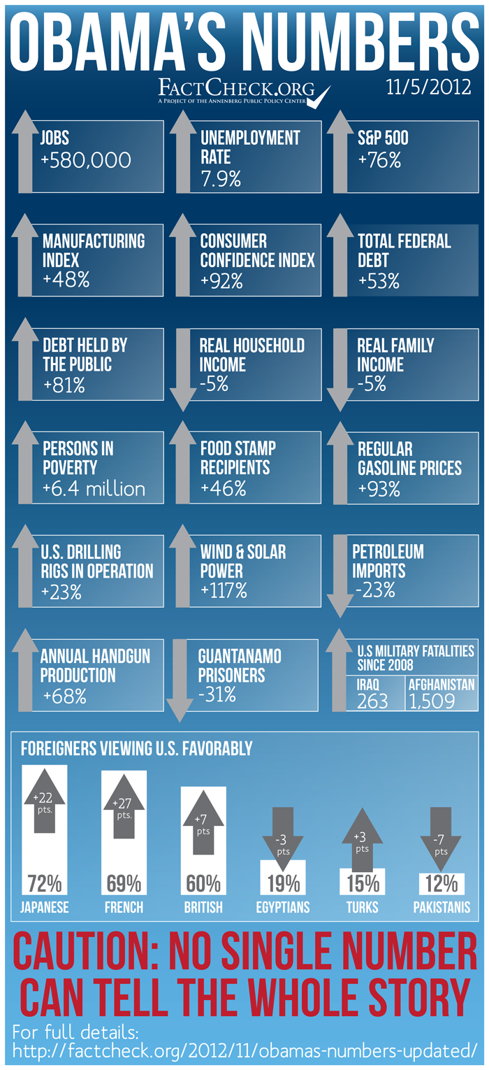
In the interest of timeliness and accuracy, we are issuing an updated version of “Obama’s Numbers,” our collection of key measures of the president’s time in office. A few things have changed since we published our original version Oct. 8 — some for better, and some for worse.
The number of jobs has increased substantially with the latest report from the Bureau of Labor Statistics, for example. There are now about 580,000 more people employed than when Obama took office, counting a gain of 171,000 jobs in October, plus upward revisions to the preliminary gains for August and September, and the annual “benchmarking” correction that the BLS announced previously, to be applied to this year’s monthly numbers in January.
However, the number of unemployed people looking for work also increased in October — to just under 12.3 million — pushing the jobless rate up to 7.9 percent of the workforce. That rate now stands 0.1 percent higher than when Obama took office.
Also changing for the worse: The national debt has continued to increase. Debt owed to the public is now 81 percent higher than it was on the day the president was sworn in. (It was 79 percent on Oct. 8.) The stock market has shed some gains, and the Standard & Poor’s 500-stock index closed on Nov. 2 at a level that was 76 percent higher than when the president took office. (It was 81 percent before.) And several more Americans have died in Afghanistan. As of Nov. 2 the total of U.S. military fatalities there since 2008 totaled 1,509, according to a Department of Defense spokesman.
Numbers that have improved include gasoline prices, which have dropped substantially. The average national price of regular in the 7 days ending Oct. 29 was 93 percent higher than it was just before Obama took office. (It had been 106 percent higher.) Consumer confidence has continued to improve — a good sign for the future — and the index published by the Conference Board is now 92 percent above where it was at the start of Obama’s term. (It had been 86 percent higher when we posted our original graphic.) And more recent figures from the Energy Information Administration show wind and solar power generation is now 117 percent higher than at the start of Obama’s term, up by one percentage point since our October tally.
For such figures as poverty and family income, we have no new annual statistics. Some other figures have changed, but by too little to affect the whole-number percentage figures we give here. For example, the number of people on food stamps went up another 11,532 in July, to just under 46.7 million. The total is now 45.96 percent higher than at the start of Obama’s term, up by 0.04 percent from before. But our figure, because it is rounded to the nearest whole number, remains unchanged at a 46 percent increase for the president’s term so far.
As we cautioned before, no single number, or collection of numbers, can tell the entire story of a president’s time in office. And, of course, opinions will differ as to how much blame or credit any president should get for things that happen on his watch. The increase in the national debt, for example, is not entirely Obama’s doing. As we’ve noted numerous times, federal spending was running $1.2 trillion above expected revenues at the time he took office, and the economy lost over 800,000 jobs in January 2009 before he was sworn in, and 724,000 the month after.
So take these figures for what they are worth: A statistical sketch of changes that occurred during Obama’s time in office, as accurate and timely as we can make it on the eve of election 2012.
— Brooks Jackson
