Summary
The numbers are nearly all in now. What they show about what really happened during the eight years that Barack Obama was president is sometimes different from what politicians claimed.
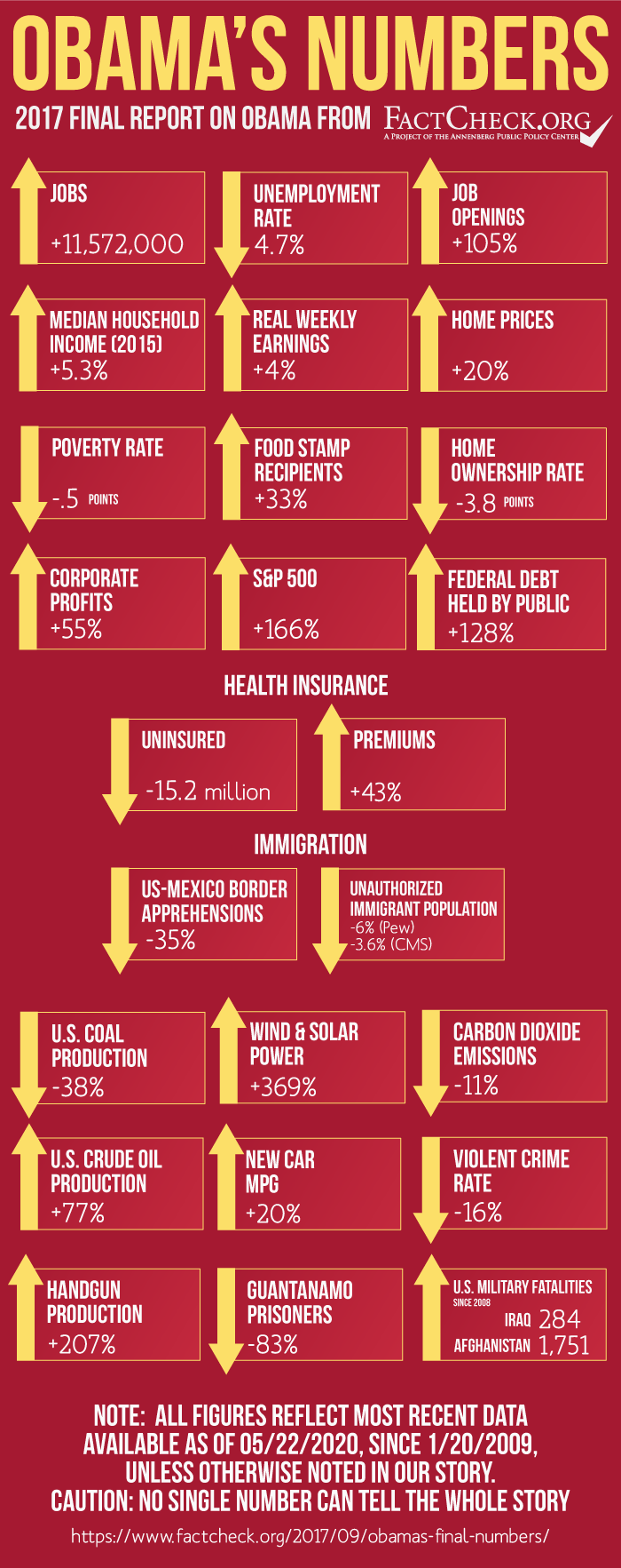
- The economy gained a net 11.6 million jobs. The unemployment rate dropped to below the historical norm.
- Average weekly earnings for all workers were up 4.2 percent after inflation. The gain was 3.7 percent for just production and nonsupervisory employees.
- After-tax corporate profits also set records, as did stock prices. The S&P 500 index rose 166 percent.
- The number of people lacking health insurance dropped by 15 million. Premiums rose, but more slowly than before.
- The federal debt owed to the public rose 128 percent. Deficits were rising as Obama departed.
- Home prices rose 20 percent. But the home ownership rate hit the lowest point in half a century.
- Illegal immigration declined: The Border Patrol caught 35 percent fewer people trying to get into the U.S. from Mexico.
- Wind and solar power increased 369 percent. Coal production declined 38 percent. Carbon emissions from burning fossil fuel dropped 11 percent.
- Production of handguns rose 207 percent, to a record level.
- The murder rate dropped to the lowest on record in 2014, then rose and finished at the same rate as when Obama took office.
Analysis
Gathering statistics is a painstaking and time-consuming job. Figures on crime, household incomes and poverty in 2016 weren’t released until September 2017, for example.
But now we have a reasonably complete statistical picture of the Obama years, which began in the middle of the worst economic downturn since the Great Depression, and ended with the highest level of household income ever recorded.
These facts often turn out to be at odds with the impressions created by candidates who, for example, claimed wages and incomes were stagnant when in fact they were rising. The facts also can conflict with impressions created by news media reporting dramatic but untypical events. Despite nonstop coverage of several mass shootings, for example, the murder rate was going down for most of the Obama years, hitting the lowest ever recorded in 2014.
Some of these figures remain subject to tweaks and revisions. Figures on handgun production in 2016 are still “preliminary,” for example, and others will remain subject to slight revisions for years to come, as statisticians routinely refine their methods and assumptions. We will keep this update current as necessary in the months and years to come. For now, it’s as “final” as possible.
Update, May 22, 2020: This revision differs in small respects from the original, which reflected the most recent official statistics available at the time. Statistical agencies subsequently issued routine, periodic refinements of their estimates of employment, unemployment, job openings, real weekly earnings, corporate profits and international trade going back several years. Also, final figures replaced preliminary statistics for handgun production in Obama’s final year. This version reflects official statistics as they stand on this date.
Jobs and Unemployment
Jobs — Over Obama’s eight years in office, the economy added a net total of nearly 11.6 million jobs — a gain in total nonfarm employment of 8.6 percent, according to the Bureau of Labor Statistics.
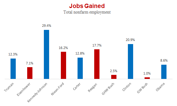
That percentage gain is not as large as for most other administrations since the end of World War II.
In fact, the only other post-war administrations to see smaller gains in employment were those of Obama’s predecessor, George W. Bush, who eked out a bare 1 percent gain, Dwight D. Eisenhower (7.1 percent in his eight years), and Bush’s father, George H.W. Bush (2.5 percent during his four years).
Jimmy Carter saw a much stronger employment gain — 12.8 percent — despite the fact that his administration lasted only four years, half as long as Obama’s.
Note: For these historical comparisons, we’ve begun with the inauguration of Harry Truman in 1949, when he became the first president elected after the end of World War II. For simplicity, we’ve combined the administrations of Democrats John F. Kennedy and his successor, Lyndon B. Johnson (who took office after Kennedy was assassinated), and of Republicans Richard Nixon and his successor, Gerald Ford (who served out the remainder of Nixon’s second term after Nixon resigned), as though each were single eight-year administrations.
In our graphics, we show Republican administrations in red, Democratic administrations in blue.
Obama had the unique disadvantage of taking office in the midst of the worst financial crisis since the Great Depression. More than 4 million jobs were lost in his first year in office, on top of the 4 million lost in George W. Bush’s final year.
To be sure, Bush’s eight years were marked by two recessions, including one that began two months after he took office in 2001. That helps explain why job creation on his watch was by far the worst of any post-war administration.
Both Bush and Obama also were bucking strong demographic trends. The surging percentages of women entering the job market, which started in the 1960s, peaked at the end of the Clinton administration. Also, “baby boomers” — those born in the years after WWII veterans returned from the war to take up family life — reached retirement age in great numbers during Obama’s time.
Labor Force Participation — Because of these and other factors, relatively fewer people said they wanted to work. Under Obama, the labor force — those either working or actively looking for a job — slipped from 65.7 percent of those age 16 and older to 62.9 percent.
Job Openings — With relatively fewer people seeking employment, a job shortage changed to a worker shortage under Obama. The Department of Labor reported that the number of unfilled job openings more than doubled during Obama’s time, hitting 6.1 million in July 2015. That was at the time the highest in the more than 16 years that Labor Department statisticians had tracked this number.
Before Obama’s tenure, the only time job openings topped 5 million was January and February 2001. When Obama left office in January 2017, there were still 5.6 million openings, an increase of 105% above the month he took office.
Unemployment — The unemployment rate was high when Obama took office — 7.8 percent — and it continued to get worse in his first year. It peaked at 10 percent in October 2009 and didn’t drop below 9 percent until two years after that.
But slowly, and more or less steadily, the rate improved. By the time Obama left office, the jobless rate had dropped 3.1 percentage points, an improvement second only to that during the Kennedy-Johnson years.
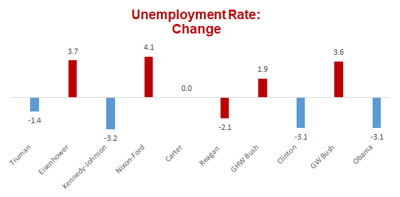
By the time Obama left office, the jobless rate was down to 4.7 percent — well below the historical norm of 5.6 percent (the median rate for all the months between Harry Truman’s inauguration in January 1949 and the end of the Obama administration).
But getting down to that point was a long, slow grind. So slow that over all of Obama’s 96 months in office, the median jobless rate was 7.7 percent — the highest for any administration since the end of World War II.
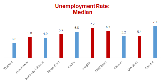
Obama’s experience is similar to that of Ronald Reagan — who presided over the second highest median jobless rate, 7.2 percent.
In Reagan’s first term, unemployment peaked at 10.8 percent — higher than Obama’s 10 percent peak. And under Reagan, it stayed at or above 10 percent for 10 straight months starting in September 1982 — compared with Obama’s one-month high of 10 percent.
Like Obama, Reagan also saw the rate decline steadily after the worst was over.
By the time Reagan left office in January 1989, the rate was down to 5.4 percent, not far above Obama’s final month at 4.7 percent.
Both Obama and Reagan left office with job approval ratings above 50 percent.
Income and Poverty
The inflation-adjusted incomes of American households reached the highest level ever recorded under Obama. The Census Bureau’s measure of median household income reached $59,039 in 2016. That was $2,963 more in “real” (inflation-adjusted) dollars than in 2008, for an overall gain of 5.3 percent.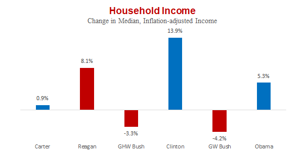
The median figure represents the midpoint — half of all households earned more, half less. And while real median income hit a record level in Obama’s final year, it was a long, rough road to the top.
In fact, the 5.3 percent gain under Obama barely made up for the 4.2 percent loss under his predecessor. And for his first six years in office, median income was below the level in 2008.
Obama’s 5.3 percent gain was less than the 13.9 percent gain under Bill Clinton, and the 8.1 percent gain under Reagan. It is also pushed up to a degree by a change in the Census Bureau’s survey questions in 2014, designed to correct for under-reporting of certain types of income in previous years.
The trend to higher incomes also shows up in the Bureau of Labor Statistics’ monthly report on average weekly earnings for all workers, adjusted for inflation. That figure, which includes salaried managers and supervisors, was 4.0 percent higher in the month Obama left office than it was in the month he first entered the White House. It was 4.2 percent higher for just production and nonsupervisory employees.
As incomes rose, the rate of poverty declined. The percentage of Americans living with income below the official poverty line went down to 12.7 percent of the population in 2016, a half-point drop compared with 2008.
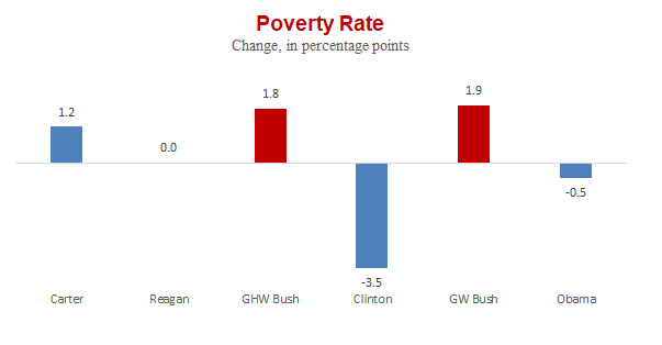
That decline also wasn’t nearly enough to reverse the 1.9 percentage point rise in poverty under George W. Bush, and it was far less than the 3.5 percentage point decline under Clinton.
And even though the rate of poverty went down under Obama, the number of people in poverty rose — just not as fast as the population in general. In 2016, just over 40.6 million Americans were still living below the poverty line, an increase of 787,000 people compared with 2008. Under George W. Bush, the number went up by more than 8 million, after going down by more than 6 million under Clinton.
Home Prices
Home values rebounded under Obama, reaching a new high in his final year.
Sales figures from the National Association of Realtors show the national median price of an existing, single-family home was $235,500 in 2016. That was $38,900 higher than in 2008, an increase of 19.8 percent under Obama.
The 2016 figure was a record, but only in raw dollars, without accounting for inflation. Prices reached their pre-recession high in 2006. In the decade between then and Obama’s final year, home prices rose 6.1 percent, while the Consumer Price Index rose 19 percent.
Home Ownership
The home ownership rate drifted down under Obama, touching the lowest point in more than half a century during his final year.
In the second quarter of 2016, 62.9 percent of households owned their own home, according to Census Bureau figures. That ties the lowest point since the Census Bureau began collecting the figures. The last time the rate was that low was in the third quarter of 1965.
The home ownership rate began its slide after peaking at 69.2 percent in the second quarter of 2004. It already had come down 1.7 percentage points before Obama took office, but it went down by a greater amount in his two terms as president.
In Obama’s last quarter, the rate rebounded to 63.7 percent, as the economy improved and sales of new and existing homes hit their best pace since before Obama entered office. But the ownership rate was still 3.8 percentage points lower than the quarter before he took office.
Food Stamps
The number of people receiving food aid under the Supplemental Nutrition Assistance Program (formerly known as “food stamps”) rose by a third under Obama.
In Obama’s last month in office, there were just under 42.7 million Americans receiving SNAP assistance, a gain of 10.7 million or just under 33.5 percent from January 2009.
The number grew as the 2007-2009 recession threw millions out of work, as benefit levels were boosted for several years by the stimulus legislation Obama signed in 2009. The average benefit per person went up from around $113 per person in January 2009 to around $134 in July.
At the peak of food stamp enrollment in December 2012, a total of 47.8 million were receiving aid, an increase of nearly 16 million or 49 percent.
But then millions melted from the rolls as employment and incomes improved, and as Congress cut benefit levels, which dropped to a monthly average of around $124 per person in Obama’s final month.
Measured from his first month to his last, benefit levels and enrollment both grew less under Obama than under his predecessor.
Under George W. Bush, the number of people getting food stamps grew by 14.7 million, or 85 percent (compared with the 10.7 million, 33 percent gain under Obama). The average monthly benefit per person grew from $73.89 in the month Bush took office to $113.60 the month he left. That’s a 54 percent increase, compared with the 9 percent gain at the end of Obama’s time in office.
Corporate Profits
Corporations did much better than workers during Obama’s time. Their profits hit several new yearly highs during his tenure.
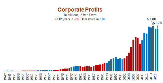
Profits had surged under George W. Bush as well, but when Obama took office they had plunged from their previous peak in 2006, due to the financial crisis and ensuing economic downturn. Then they recovered quickly under Obama — far more quickly than jobs or personal incomes — and reached a new record in 2010, his second year in office.
From there they climbed even higher, setting more new annual records in 2012 and 2014, when they reached $1.86 trillion.
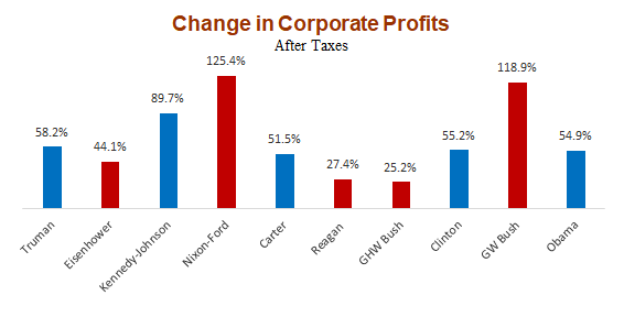
Profits slipped a bit in 2015, but in Obama’s final year profits were still $1.74 trillion — which is 54.9 percent higher than in 2008, the year before he took office.
In percentage terms, the gain in corporate profits under Obama was less than half the increases under George W. Bush and the Nixon-Ford administration, but twice the increase under Reagan. and almost the same as under both Clinton and Carter.
Technical note: There are several ways to measure corporate profits. We present here the same historical measure followed by Federal Reserve Bank economists, which gauges profits of U.S. corporations from all their global operations, after taxes and without adjustments for inflation, inventory changes or changes in capital (such as depreciation.) Annual figures go back to 1929, and can be found on line 45 of BEA’s “National Income by Types of Income” table (Table 1.12).
Stock Prices
Owners of corporate stocks also did quite well under Obama. The Standard & Poor’s 500-stock average more than doubled — rising by 166 percent during his eight years in office.
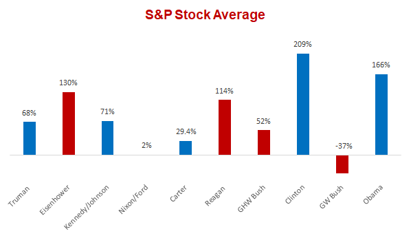
Among post-war administrations, that’s second only to the 209 percent rise in the S&P index during Clinton’s two terms, and it handily outpaced the 114 percent gain under Reagan.
To some extent, the gain under Obama represents a rebound from an unusually depressed level. The financial crisis of 2007-2009 caused stock prices to plunge. By George W. Bush’s last day in office, the S&P 500 stood 37 percent below where it had been on the last trading day before he first took office in 2001.
Other stock market indexes tell similar stories. The Dow Jones Industrial Average rose 138 percent under Obama after falling 22 percent under his predecessor, for example.
Some of the gain took place in the weeks just after Trump was elected, a “Trump Rally” that many attribute at least partly to investor optimism that the president-elect would, once in office, cut taxes and regulation as promised. But the S&P rise between Election Day and Obama’s last day in office was just under 6 percent — a small fraction of the entire gain during Obama’s tenure. Stock prices already had set record after record before Trump’s election, as we have written before.
Debt and Deficits
The federal debt more than doubled under Obama, and he left Trump a legacy of worsening deficits.
Debt — On the day Obama left office, the U.S. government’s debt owed to the public was more than $14.4 trillion, an increase of more than 128 percent during his eight years.
The debt also has grown dramatically even when measured as a percentage of the growing economy, from 52.3 percent of gross domestic product at the end of fiscal year 2009 to 77.0 percent as of the end of fiscal year 2016 on Sept. 30, 2016, according to historical budget figures from the Office of Management and Budget.
Deficits — Under Obama, annual federal deficits fell, but then turned up again.
The deficit hit $1.4 trillion in fiscal year 2009. As we’ve documented elsewhere, Obama inherited most of that deficit and signed spending measures that contributed as much as $203 billion to FY 2009’s red ink.
After that, the yearly deficits declined markedly for several years. In fiscal year 2015, the deficit was $438 billion, a drop of 69 percent from FY 2009.
But deficits were again on the rise as Obama left office. The nonpartisan Congressional Budget Office estimated in June 2017 that the deficit for FY 2017 — which ends Sept. 30 and is the last one for which Obama signed spending bills — will increase to $693 billion.
CBO also projects that under current law, annual deficits will again exceed $1 trillion in 2022 and beyond. As things stand, federal debt owed to the public will reach 80 percent of GDP in 2020, and more than 91 percent in 2027, CBO projects.
Health Insurance
Coverage — Millions of Americans gained health insurance coverage as a result of the Affordable Care Act, also known as Obamacare.
The percentage of all U.S. residents who lack coverage dropped sharply, from 14.7 percent the year before Obama entered the White House to 9.0 percent in his final year — the lowest on record. Nevertheless, those gains fell far short of Obama’s 2007 campaign promise to “cover every American.”
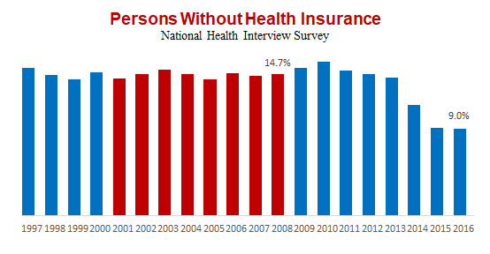
Our data come from the National Health Interview Survey conducted by the Centers for Disease Control and Prevention, which has tracked health insurance coverage on a reasonably consistent basis since 1997.
According to NHIS figures, 43.8 million Americans of all ages lacked health insurance in 2008, but in 2016 that number was down to 28.6 million — a drop of 15.2 million people.
The number of uninsured actually rose during the first two years of Obama’s time, reaching 48.6 million in 2010. That’s because of the Great Recession of 2007-2009, when millions of workers lost their jobs, and any health insurance benefits that went with them.
The number of uninsured drifted down after that, as the economy slowly recovered. But then it dropped sharply beginning in 2014, the first year that the ACA’s main provisions took effect. Those provisions required that individuals obtain coverage or pay a tax penalty, made government-paid Medicaid available more widely to millions of additional low-income people, and provided government subsidies to help those further up the income scale pay for private insurance.
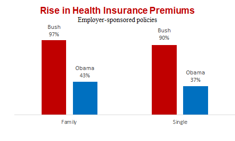
Premiums — Obama also failed to deliver on his campaign promise to “lower your premiums by up to $2,500 per family per year.” For the typical worker, premiums continued to rise faster than wages or inflation, though more slowly than before.
Premiums for employer-sponsored health insurance (which covers nearly 56 percent of the population, according to Census figures) rose 43 percent under Obama for family policies, and 37 percent for policies covering a single person.
That information comes from annual surveys by the Kaiser Family Foundation and the Health Research & Education Trust, which is the nonprofit research arm of the American Hospital Association.
To be sure, premiums rose twice as fast before Obama took office. Family rates rose 97 percent and single-coverage rates rose 90 percent during George W. Bush’s eight years in office.
But the rise under Obama continued to outpace the average weekly earnings of all employees (up 20 percent under Obama) and the rise in consumer prices (up 15 percent).
The effect on take-home pay for workers was made even larger because employers picked up a somewhat smaller share of the total cost of health coverage on average.
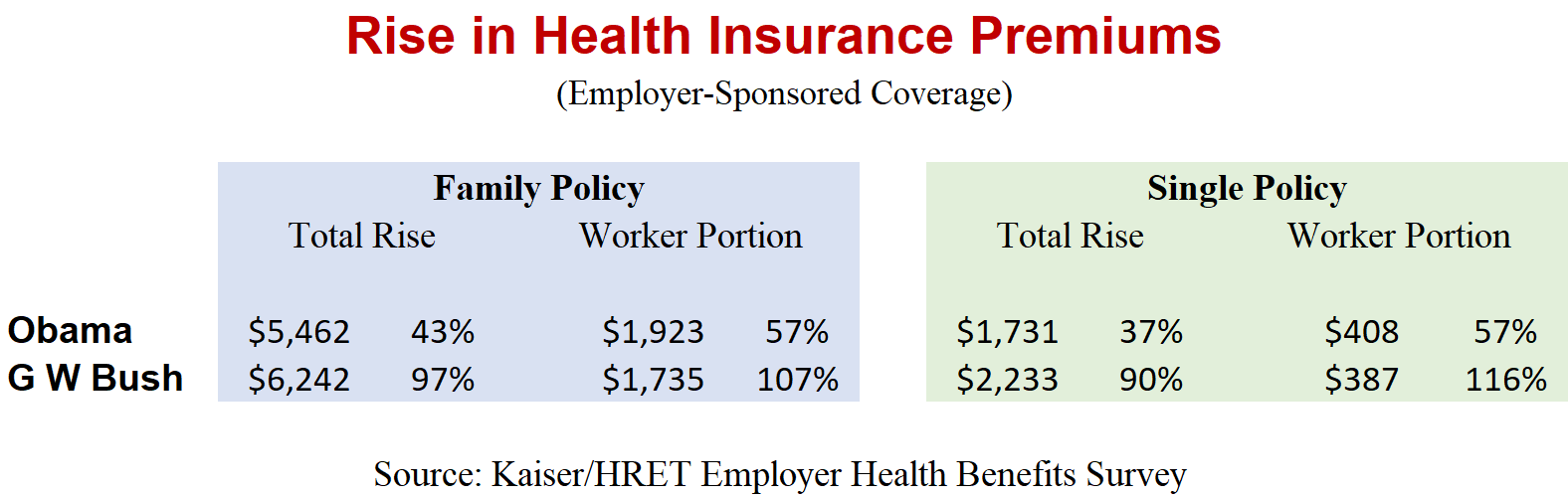
Under Obama, the worker portion of annual health insurance premiums rose by $1,923 for a family policy, and $408 for single coverage. Both those figures represented a 57 percent increase during his eight years in office.
Obama promised to lower premiums when he first ran for the White House. “We’re going to work with your employers to lower your premiums by up to $2,500 per family, per year,” he said. At another point, he said, “We will start by reducing premiums by as much as $2,500 per family.” Aides said when Obama spoke of “lowering” or “reducing” premiums he really meant that he would reduce the rate of growth, though he did not make that clear when speaking to voters.
Immigration
The flow of people caught crossing the U.S.-Mexico border illegally slowed markedly under Obama. In his final year, the U.S. Border Patrol apprehended just under 443,000, down 35 percent from the year before he took office.
Though it’s impossible to know how many illegal crossings went undetected, the number of those apprehended is the best available indicator of the overall trend.
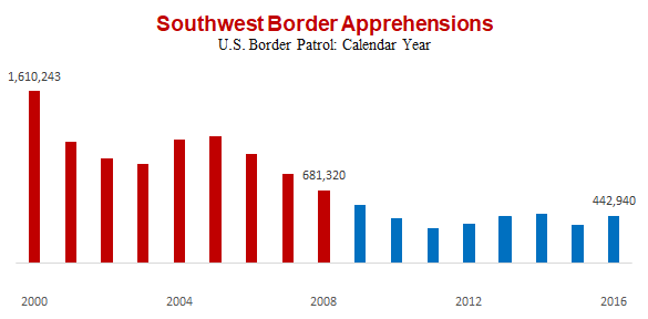
The percentage decline under Obama was far less than the 58 percent decline under George W. Bush, who nearly doubled the number of agents stationed at the Southwest border. Under funding levels established by Bush, the number grew from 9,147 agents in fiscal year 2001 to 17,408 in FY 2009 (which began Oct. 1, 2008).
Under Obama, that number continued to increase, hitting a peak of 18,611 in FY 2013. The number then declined to 17,026 in fiscal year 2016.
Meanwhile, the number of immigrants living in the U.S. illegally actually fell, from an estimated 11.7 million in 2008, to an estimated 11.0 million in 2015, according to the Pew Research Center. That’s a decline of roughly 700,000, or 6 percent.
Similarly, the Center for Migration Studies estimated that the population of immigrants living in the U.S. illegally dropped from 11,460,000 in 2008 to 11,045,000 in 2015, a decline of 415,000, or 3.6 percent. The CMS study attributed the decline to tighter airline security, increased enforcement at the border and improving economic conditions in Mexico.
Such estimates are inexact; those breaking the law by being here can’t be expected to confess that to Census officials. But demographers have applied consistent methodologies from year to year, and agree that the trend has been downward.
Energy
Oil — U.S. crude oil production, mainly due to advances in drilling technology, surged under Obama, helping to drive down fuel prices. In 2016, the U.S. produced 77 percent more crude oil than it did in 2008.
As a result, U.S. reliance on imported oil dropped by more than half. In 2016, the U.S. imported only 24.8 percent of the petroleum and refined products that it consumed, down from 57 percent in 2008. In 2015, it imported 24.1 percent, which was the lowest annual level of dependency on imports since 1970.
Wind & Solar — Wind and solar power has more than quadrupled under Obama. Electricity generated by large-scale wind and solar power facilities increased by 369 percent during the Obama years.
The increase in solar power in particular has been spectacular. The U.S. generated nearly 43 times more electricity from solar power in 2016 than in 2008.
Wind and solar accounted for 6.5 percent of total large-scale generation in 2016, up from a mere 1.4 percent in 2008. Wind and solar now account for as large a share as hydroelectric power, also at 6.5 percent of the total.
These figures are for “utility scale” electricity generation. In 2014, EIA also began tracking small-scale (under 1 megawatt) “distributed” solar voltaic generation, such as the power produced by rooftop systems installed by homeowners. In 2016, wind and solar accounted for 6.9 percent of the combined total of utility-scale power and “distributed” solar power.
Coal — As wind and solar rose, coal declined. Obama put forth new restrictions that his administration called a “Clean Power Plan,” and his critics dubbed a “war on coal.”
In 2016, U.S. coal production was 728 million metric tons, according to data from the U.S. Energy Information Administration. That’s a decline of 38 percent since 2008.
During the Obama years, electric utilities shifted away from burning coal, which accounted for 48 percent of their power generation in 2008, but only 30 percent in 2016. The share supplied by burning natural gas went up from 21 percent to 34 percent, and the share supplied by nuclear plants remained steady at just under 20 percent.
Carbon Emissions — Meanwhile, the amount of carbon dioxide emitted into the atmosphere from U.S. energy-related sources has declined during Obama’s time.
Between 2008 and 2016, the amount of carbon dioxide emissions from burning fossil fuels went down 11 percent, according to estimates from the EIA.
Emissions have been falling even as the economy has been growing, in part because utilities — driven by lower natural gas prices and government regulations — have been burning more natural gas and less coal. Emissions from electric power plants in 2016 were the lowest since 1988, according to EIA figures.
Trade
Obama promised in his 2010 State of the Union address to “double our exports over the next five years.” That didn’t happen.
Instead, as the economies of major U.S. trading partners struggled, so did U.S. exports.
During the full eight years of Obama’s presidency, annual exports of goods and services rose by just over 20 percent (and actually declined in 2015 and 2016).
Meanwhile imports grew even more slowly, by just 6.6 percent, and so the U.S. trade deficit shrunk by 29 percent.
Guns
Obama campaigned on a promise to reinstate the “assault weapon” ban that expired in 2004, but that didn’t happen either. As president, he also proposed several new gun laws that never passed.
Instead, annual U.S. handgun production tripled, as millions of Americans flocked to buy firearms.
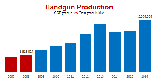
In 2016, production of pistols and revolvers totaled 5,576,366 according to final figures released by the Bureau of Alcohol, Tobacco, Firearms and Explosives. That’s an increase of 207 percent over the figure for 2008, and it broke the previous record set in 2013.
The government doesn’t collect figures on sales of guns. But the National Shooting Sports Foundation — the gun industry’s trade group — tracks approximate sales figures by adjusting FBI statistics on background checks to remove those not related to actual sales, such as checks required for concealed-carry permits.
Those NSSF-adjusted figures also set a record in Obama’s final year, topping 15.7 million. That’s an increase of 75 percent above the 2008 level.
These figures cover rifles and shotguns and previously owned weapons, as well as new handguns. They are only an approximation of actual sales, since some of these checks cover purchases of multiple weapons, and of course some sales still occur without background checks.
Crime
Despite more than a score of mass shootings, crime declined substantially overall during the Obama years.
The FBI’s crime statistics show the number of violent crimes in 2016 was 10.3 percent lower than the number in 2008, and the number of property crimes dropped 18.9 percent. Among violent crimes, the biggest drop was a 25 percent reduction in robberies.
Meanwhile the population increased by more than 6 percent, so the rate of crime dropped even more. The number of violent crimes per 100,000 population was nearly 16 percent lower in 2016 than in 2008, and the property crime rate dropped nearly 24 percent.
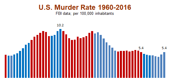
But the murder rate didn’t drop at all — it was 5.4 per 100,000 both in 2008 and in 2016.
Earlier, in 2014, the murder rate had dropped to the lowest level on record — 4.4 per 100,000 — but it rebounded in Obama’s final two years in office.
Car Mileage
Obama set a goal of doubling the fuel efficiency of cars and light trucks, but that promise isn’t working out. Although he put in place a regulatory requirement that cars and light trucks average 54.5 miles per gallon by model year 2025, car buyers had other ideas.
For light duty vehicles actually purchased, the average EPA city/highway sticker mileage has been stuck at 25.1 mpg for model years 2014, 2015 and 2016, according to the Transportation Research Institute of the University of Michigan.
Model year 2017 isn’t looking any different. Vehicles sold during Obama’s final month in office also averaged 25.1 mpg — only 20 percent above where it was eight years earlier. Meanwhile, the Obama mileage regulations are under review by the new administration.
Guantanamo
During Obama’s final 20 days in office another 18 prisoners were released from the military detention camp for suspected terrorists in Guantanamo Bay, Cuba, and shipped to other countries. That brought the total number remaining to 41.
When he first took office, Obama ordered the facility to be closed within a year. But Congress balked, and in the end Obama was able to accomplish an 83 percent reduction in the head count over eight years.
War Deaths
During Obama’s time in office, 2,035 U.S. military personnel died as a result of the Afghan war and the fighting in and around Iraq, according to figures kept by iCasualties.org.
Between Jan. 20, 2009, and Jan. 20, 2017, there were 1,751 U.S. military fatalities connected to the Afghan war, which became America’s longest war in 2010 and still has no end in sight.
Also during Obama’s time, there were 284 fatalities connected to the conflict in Iraq. He pulled all U.S. troops out of Iraq at the end of 2011, but began sending them back in 2014 after Islamic State fighters swooped in and captured large sections of the country.
Editor’s Note: In January, we plan to publish our first quarterly report on President Donald Trump.
Update, Sept. 24, 2018: We updated the Crime section (and its accompanying graphic) to reflect revisions made by the FBI in 2016 figures contained in its Crime in the United States report released today. The FBI revised the 2016 homicide rate to 5.4 percent from the 5.3 percent originally reported. The number of violent crimes, property crimes and robberies were also revised slightly from the levels the FBI originally reported.
Sources
Bureau of Labor Statistics. “Employment, Hours, and Earnings from the Current Employment Statistics survey (National); Total Nonfarm Employment, Seasonally Adjusted.” Data extracted 27 Sep 2017.
Bureau of Labor Statistics. “Labor Force Statistics from the Current Population Survey; Unemployment Rate, Seasonally Adjusted.” Data extracted 27 Sep 2017.
Bureau of Labor Statistics. “Job Openings and Labor Turnover Survey: Job Openings, Seasonally Adjusted.” Data extracted 27 Sep 2017.
Bureau of Labor Statistics. “Labor Force Statistics from the Current Population Survey; Labor Force Participation Rate.” Data extracted 27 Sep 2017.
U.S. Census Bureau. “Income, Poverty and Health Insurance Coverage in the United States: 2016.” 12 Sep 2017.
Bureau of Labor Statistics. “Employment, Hours, and Earnings from the Current Employment Statistics survey (National); Average Weekly Earnings of All Employees, 1982-1984 Dollars.” Data extracted 27 Sep 2017.
National Association of Realtors. “Sales Price of Existing Single-Family Homes.” 20 Sep 2017.
U.S. Census Bureau. “Time Series: Not Seasonally Adjusted Home Ownership Rate.” Data extracted 27 Sep 2017.
U.S. Department of Agriculture, Food and Nutrition Service. “Supplemental Nutrition Assistance Program (Data as of Sept. 8 2017).” Data extracted 27 Sep 2017.
U.S. Department of Agriculture, Food and Nutrition Service. Supplemental Nutrition Assistance Program (SNAP) data, fiscal years 1968-2017.
U.S. Bureau of Economic Analysis. “Table 6.19D. Corporate Profits After Tax by Industry.” 3 Aug 2017. Data extracted 27 Sep 2017.
Bureau of Labor Statistics. “Consumer Price Index – All Urban Consumers.” Data extracted 27 Sep 2017.
S&P Dow Jones Indices, “500 and DJI Daily Historical,” proprietary data furnished upon request and used with permission under academic license. 29 Aug 2017.
U.S. Treasury. “The Debt to the Penny and Who Holds It.” Data extracted 27 Sep 2017.
Office of Management and Budget. “Table 7.1—Federal Debt at the End of Year: 1940–2022.” May 2017.
Congressional Budget Office. “An Update to the Budget and Economic Outlook: 2017 to 2027″ Table 1. 29 Jun 2017.
Centers for Disease Control and Prevention; National Health Interview Survey. “Early Release of Selected Estimates Based on Data From the 2016 National Health Interview Survey.” May 2017.
Kaiser Family Foundation. “Premiums and Worker Contributions Among Workers Covered by Employer-Sponsored Coverage, 1999-2017.” 19 Sep 2017.
U.S. Border Patrol. “Total Illegal Alien Apprehensions By Month” Fiscal Years 2000-2016. Undated. Accessed 25 Sep 2017.
U.S. Border Patrol. “U.S. Border Patrol Apprehensions FY2017 YTD(October 1 – August 31).” Undated. Accessed 25 Sep 2017.
U.S. Border Patrol. “Border Patrol Agent Staffing by Fiscal Year.” 1 Oct 2016.
Passel, Jeffrey et al. “Table A1: Unauthorized Immigrant Population.” Pew Research Center. 3 Sep 2014.
Passel, Jeffrey et al. “As Mexican share declined, U.S. unauthorized immigrant population fell in 2015 below recession level.” Pew Research Center. 25 April 2017.
Warren, Robert. “Zero Undocumented Population Growth Is Here to Stay and Immigration Reform Would Preserve and Extend These Gains.” Center for Migration Studies. Jun 2017.
U.S. Energy Information Administration. “U.S. Crude Oil Production.” Short Term Energy Outlook. 12 Sep 2017. Data extracted 27 Sep 2017.
U.S. Energy Information Administration. “Table 3.3a Petroleum Trade: Overview.” Monthly Energy Review. 28 Aug 2017.
U.S. Energy Information Administration. Electric Power Monthly, “Table 1.1.A. Net Generation from Renewable Sources: Total (All Sectors), 2007-July 2017.” 26 Sep 2017.
U.S. Energy Information Administration. “Coal Production; Total U.S.” Short Term Energy Outlook. 12 Sep 2017. Data extracted 27 Sep 2017.
U.S. Energy Information Administration. “Table 12.1 Carbon Dioxide Emissions From Energy Consumption by Source,” Monthly Energy Review. 28 Aug 2017.
U.S. Department of Commerce, Bureau of Economic Affairs. “Table 1. U.S. International Transactions: Exports, Imports and Balances.” 6 Sep 2017.
U.S. Bureau of Alcohol, Tobacco, Firearms and Explosives. “Annual Firearms Manufacturing and Export Report,” Year 2016 Interim.” 27 Jun 2017.
U.S. Bureau of Alcohol, Tobacco, Firearms and Explosives. “Annual Firearms Manufacturing and Export Report,” Year 2008.” 8 Mar 2011.
National Shooting Sports Foundation. “NSSF-Adjusted NICS – Historical Monthly Chart” Proprietary data supplied on request. 25 Sep 2017.
Federal Bureau of Investigation. “Crime in the United States 2016.” Table 1. 25 Sep 2017.
Sivak, Michael and Brandon Schoettle. “Average sales-weighted fuel-economy rating (window sticker) of purchased new vehicles for October 2007 through August 2017.” University of Michigan Transportation Research Institute. 5 Sep 2017, Accessed 25 Sep 2017.
New York Times. The Guantanamo Docket. “Timeline: A chronology of detainees’ arrivals, transfers and deaths.” 27 Sep 2017.
iCasualties.org. “Operation Enduring Freedom; Afghanistan Coalition Military Fatalities .” Data extracted 27 Sep 2017.
iCasualties.org. “Operation Iraqi Freedom; Iraq Coalition Military Fatalities.” Data extracted 27 Sep 2017.